
What goes into a counselling website design?

When creating a counselling website design, a different focus is required compared to a small business that sells products. The visual language, copy and calls to action need to be focused on the user, and not use any pressure or ‘hustle’ as people looking for therapy might already be already be stressed and anxious. Here are some tips to create the right first impression.
Your Site’s Visual Language
Think about the physical space where you see clients. You probably have comfortable seating, soft lighting, maybe a plant or two, and a sense of privacy. Your website should feel exactly the same.
When we talk about “visual language,” we aren’t just talking about a pretty layout; we’re talking about non-verbal communication. Here’s how to make your site feel like a safe place to land.
The Power of “White Space”
In design, white space is just the empty room around your text and images. For a counsellor’s site, this is your most important tool. Densely packed text feels like a “wall of noise.” Generous spacing, however, gives the visitor’s eyes a place to rest. It signals that there is room for them to breathe and think.
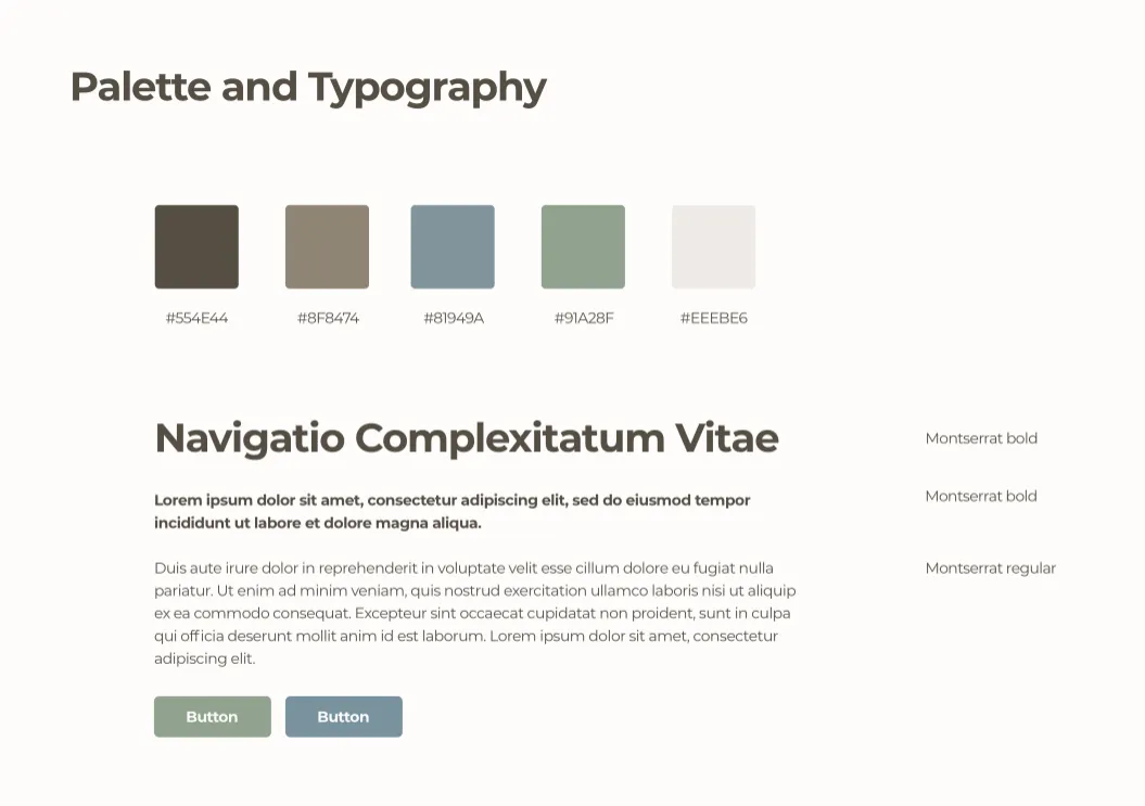
A Palette of Calm
You don’t have to stick to clinical blues and whites. However, high-contrast, “neon” energy usually doesn’t sit well in this niche. The goal is to choose colors that suggest empathy and stability, rather than urgency or excitement. Our recent Waterways Therapy project is a good example of a calming visual style.
Earth Tones: Sage greens, warm terracottas, and soft sands feel grounded and natural.
Muted Pastels: Dusky blues or soft mauves feel gentle and inviting.
A calm palette we designed for Waterways Therapy
Photography: Authentic vs. “Stocky”
We’ve all seen the images of a person sitting with their head in their hands in a dark room. This could actually be quite ‘triggering’ for someone already struggling.
Instead of “Pain”, focus on symbols of growth and peace. Think of natural light hitting a wooden desk, a path through a forest, or a close-up of a warm cup of tea. Water and bridges also work well as metaphors.
The Human Connection: If you’re comfortable, a clear, warm photo of you is the most important visual on the site. It breaks the “digital ice” and starts building the therapeutic alliance before the first “hello.”
Typography that Talks (Gently)
The “font” you choose has a voice. There are hundreds of lovely free fonts out there we can use in your counsellor web design, so you don’t have to stick to Arial!
Serif fonts (the ones with little feet, like Georgia) often feel established, traditional, and wise.
Sans-serif fonts (clean and modern, like Montserrat) feel approachable, clear, and straightforward.
Whatever you choose, make sure it’s large enough to read easily and the colour contrast is high to ensure the text is readable to as many folks as possible. Accessibility isn’t just a “tech requirement”—it’s a way of showing care for your visitors.
Copywriting for Connection
In counselling website design, your website copy is almost your “first session.” If it feels like a high-pressure sales pitch, a vulnerable client will close the tab. If it feels too academic, they might zone out and not feel understood.
The “You” vs. “I” Ratio in Counselling Website Design
Most therapist websites spend 90% of the text talking about the therapist’s degrees. To convert visitors, flip the script.
The Rule: Use “You” twice as often as “I.”
Instead of: “I am a qualified CBT therapist with 10 years of experience.”
Try: “You might feel like you’re carrying a weight that never lifts. Together, we can use CBT tools to help you find some breathing space.”
Speaking to the “Pain Point”
Don’t be afraid to name the struggle. If a client is searching for “Anxiety Counselling Nottingham,” they want to know you understand what 3:00 AM panic feels like. Describe the feeling of the problem before you offer the solution. Create a connection and build trust.
The Power of “Plain English”
Avoid clinical jargon. Terms like “modalities,” “congruence,” or “unconditional positive regard” mean a lot to other therapists, but to a client in distress, they sound like homework. Use the language your clients use when they sit on your sofa. it might sound more like “We’ll use methods that suit you and your situation.”
The Plain English Awards Crystal Mark is a fantastic idea, and more sites could benefit from their advice!
The “Ethical Call to Action”
In B2B web design, we usually say “Buy Now!” For a counsellor or therapist, that feels wrong. Use gentle, invitational language:
“If you’re ready to talk, I’m here to listen.”
“Take the first step with a free 15-minute consultation.”
Summary
Counselling website design requires a shift away from traditional “high-pressure” sales tactics in favour of creating a calm, digital waiting room. This sense of connection is further strengthened through empathetic, jargon-free copywriting that focuses on the client’s experience.
Ultimately, by replacing aggressive “hustle” culture with gentle, ethical invitations to connect, your website becomes a professional showcase that respects the user’s emotional state while building therapeutic trust.